


After returning from Spring break, The New School community got its first look at the university’s new facelift, aka the re-branding. A brand new logo was printed on banners flying from New School buildings. Outside of the University Center, the new text loomed large over Fifth Avenue.
But despite the new logo and custom printed wall-paper in the 13th Street Parsons building, some students weren’t thrilled by what they thought was a pricey and exclusive re-branding
“It’s awkward. I don’t like the concept,” said Tiffany Fung, a freshman at Parsons.
University officials defended the re-branding program as much-needed and long overdue. While the roll-out of the new design only took a few days, they said the design process began over a year ago, in early Spring 2014, when the university’s marketing team decided that the old logo, designed in 2005, no longer fit with the institution and higher education as a whole.
“I think higher education, over the 10 years since we did the last [logo], is changing very fast. It’s extremely dynamic,” said Provost, Tim Marshall in an interview with the Free Press on March 31. “The system we moved away from was fixed, was just a locked box. You couldn’t do anything with it.”
At the same meeting, President Van Zandt explained that the former logo separated the divisions from the bigger whole. “You could say Parsons the New School for Design, or Eugene Lang College the New School for Liberal Arts, but already you’re limited,” he said. “You’re not connecting Eugene Lang with Parsons, you’re not connecting Parsons with Mannes.”
Administrators said the two biggest goals of the re-branding were to bring all the individual academic programs at The New School closer together and try to make them stronger as a whole, as well as to increase public recognition.
“Each [program] individually is not as strong as they would be together,” said President Van Zandt. “So, [the new identity], is really in one sense, just one small part of the effort to pull the university together and then to raise our profile.”
“We really want to get the message this vision of the school to the people who either decide to come here and the people, at the end of the day, who are going to employ our students,” President Van Zandt added.
In March 2014, the university hired Pentagram, a multi-disciplinary design firm working directly with designer, Paula Scher. Scher has lead design development for CitiBank, the Metropolitan Opera and Microsoft, among others.
The new visual identity was released publicly on March 30, 2015. It included the new logo, font, website, merchandise and building banners. Water towers atop New School buildings were plastered with designs made by New School students using the new font and color as well as new wallpaper around the elevators in the 13th Street Parsons building. New School MetroCards will go on sale at Union Square and other select stations on April 20.
Some New School students took to social media to express their concerns over the cost of the rebranding overhaul.
“Look, I’m not an expert, but this couldn’t have been cheap,” commented a student on The New School Free Press Facebook page. “How many professors didn’t get hired because of money spent on this?”
Administration said they could not give the total price of the re-branding because of an agreement they struck with Pentagram.
“It was not that expensive relatively to what companies would spend on this kind of thing,” said President Van Zandt.
A spokesperson in the marketing and communications office, Josephine Parr, disputed the $2 million figure that was widely bandied about in Parsons communications designs courses and at faculty meetings. “The New School spends far less on marketing than our peers; universities typically spend between 3-10 percent of their operating budget on marketing and we’ve never spent more than approximately 2.4 percent.”
With an operating budget of approximately $33 million, The New School claims to spend around $800,000 on marketing, none of which was used for the most recent re-branding, said administration.
Officials took pains to point out that the rebranding costs came out of The President’s Strategic Initiative Fund, set up by President Van Zandt at the start of his presidency. Money in the fund was raised from Board of Trustee members.
“When we presented it to the trustees, they thought this was extremely important for the future of the school and they felt very comfortable using the money they had contributed to that fund to do all this work,” said Van Zandt.
Marshall followed up by saying, “The student tuition dollars does not fund this,” followed by Anne Adriance, Chief Marketing Officer, adding that the money did not come out of the operating budget, either.
The hiring of an outside design firm had many in the community questioning why the school didn’t turn to one of it’s own to develop the new look.
“It’s like saying we’re going to train a student to be a professional who can’t do their job,” said New School graduate student, Chris Crews, who has started a campaign against the re-branding. “That’s like saying if Paula Scher had gone here she wouldn’t have been able to help do that design process.”
President Van Zandt explained why the University chose to look outside TNS, saying they wanted someone who hadn’t drunk “The New School Kool-aid” to be the leader of the project.
Van Zandt defended the choice of an outside firm. “We thought that putting the burden, picking one faculty, one class, or picking a group of students in a contest of some sort, the burden would be tremendous on that person,” he said.
In response to questions about the administration’s claim that “hundreds” of students and faculty had participated in the design process, Anne Adriance, the Chief Marketing Officer, said that while students were not part of the monthly design meetings, hundreds had in fact received emails calling for their input and opinions on the designs.
Despite repeated requests, however, neither she nor the communications office provided copies of those emails.
Adriance also said that a New School-based committee, comprised of “diverse members of the community,” had worked with Scher and Pentagram. It included board members who had expertise in design and branding and people from all divisions of the school, she said.
Over the course of a year, it met at least once a month, according to Adriance. The committee would look at the most recent iteration of the design and give feedback to Scher and her design team.
“It was very much a true design process which is informed by creativity and research and then come together and people with different views and different voices addressing it from different angles and iterating to make it better,” said Adriance. “It really was informed by truly hundreds and hundreds of voices from the university.”
President Van Zandt added that that during the meetings the committee would be, “throwing stuff out, prototyping. Saying, “Well, what do you think? How’s this? How would you change that?” That’s an important part of that process.”
Paula Scher, the leading designer for the re-branding, spoke about how the committee came to an agreement on the final look.
“The group finally agreed that elements of design should come from the spirit of The New School founded in 1919 as a place of experimentation and revolutionary thought,” said Scher. “We all agreed we had to marry the past with the future.”
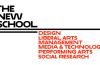
The design is based off what the committee called a “sliding scale” meaning when an individual school name, like Parsons, was coupled with other schools under the New School logo, it would be a certain size. But when Parsons existed below The New School without other schools, the text size could enlarge.
“This gave the system the ability to be flexible in addressing individual schools and programs,” said Scher.
“We can put schools under it,” said Marshall. “We can put programs under it. Put Parsons and Lang under it. We can put things that show how this institution is bringing different things together.”
“It’s quirky, it’s bizarre and it’s awkward,” Scher said. “But it’s also beautiful in its strangeness, which in repeated viewings becomes normal.”
But not all students agreed.
“I’m horrified and embarrassed,” commented sonjaloviisa on the New School’s Instagram post.
I can’t believe this is the new logo. I feel like any beginner graphic design student could have done better.”
“I think my roommate said that it looks like the Back to the Future title card,” said Thomas Bent, a junior at Lang. “It looks like their trying really hard to be like an 80s si-fi movie or something.”
Others expressed a liking for the schools new look.
“I like the new logo,” said Parsons junior, Rona Bastanog. “I feel like, typography wise, it’s more updated and more modern.”
The most talked-about aspect of the new logo was the W in “New.”
“I can’t stand the W. The W pisses me off like no other,” said Parsons junior, Allen Robbins. “It’s funny because if you look at the [lit up logo] in the Welcome Center, the window divides the W to where it actually looks like two V’s.”
“The Nevv School. Cool,” commented Colette Wacker on The New School’s Facebook page.
Adriance acknowledged that it was a topic of much discussion during the design process. Ultimately, she said, her team decided that the new logo did not actually leave one reading The Nevv School.
“It get’s you to pay attention,” Adriance said. “To stop and notice and pay attention to our name. If part of the purpose of this was to tell our story in a way that get peoples attention, then to be talking about it isn’t such a bad thing.”
Marshall had a shorter take on it.
“Don’t forget the letter W is is a double U he said. But if you look at the way type has evolved it’s become more of a double V.”
Paula Scher’s take was even pithier
“Nevv is the new New,” she said at a rebranding release event on March 30.